W3C reference (context only, see #200)
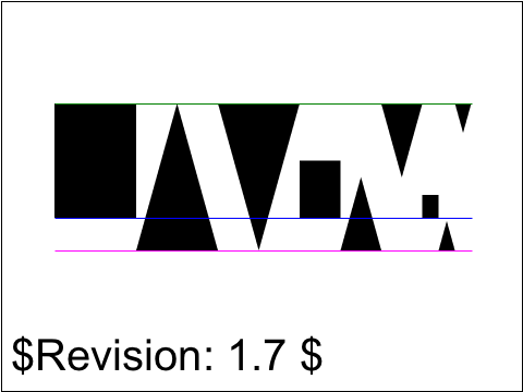
Foxglove
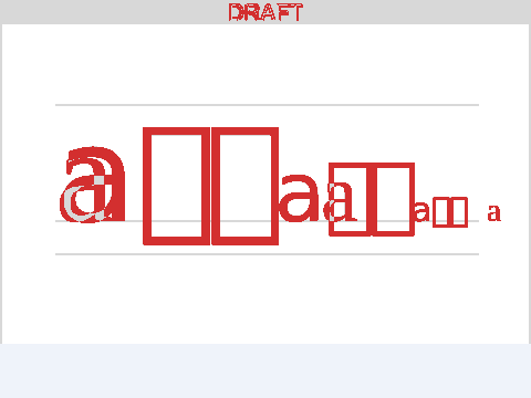
Difference
<text id="revision"> legend every test carries: it renders in a fallback font this
library cannot match, so it is excluded from the comparison entirely rather than failing every test.
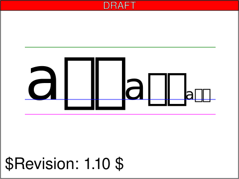
The dominant baseline should be alphabetic, so the 'a' will be sitting on the alphabetic (blue) line, the Japanese glyph (upward pointing triangle) will be aligned on the ideographic (pink) baseline and 'ण' is a Devangari character (downward pointing triangle) and will use the hanging baseline (green). The smaller versions of the characters should be aligned to the same baselines as the respective larger characters, so all like shapes align to the same baseline.
